
Framing an Antique Pocket Watch
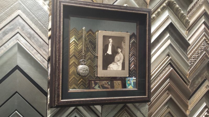
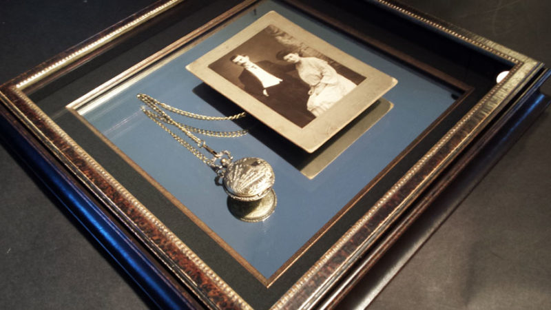 This could be my favorite shadowbox of all time and that’s saying something since I’ve been putting my passion for framing into building extraordinary frames for twenty-five years. This project is special to me because of the technique I used to mount the watch. The antique items presented a challenge and I knew I wanted an innovative and elegant solution. I’m so pleased with the finished frame. The resulting effect offers the viewer a modern approach to framing antique items. It looks so simple, but I love it most because it solved a big design dilemma. How can I show the back of the pocket watch?
The answer was to add a mirror behind the watch. That part seemed obvious. The mirror would reflect the engraving on the back of the watch, but only if the watch was away from the surface. That’s where it got tricky. I needed to use some hocus-pocus framer’s magic to suspend the watch and photo away from the mirror. What I used was close… Tru Vue’s Optium Museum Acrylic.
If you imagine the frame layers as a sandwich, the mirror and outer glazing are the bread slices. The items and acrylic they’re attached to are the delicious center. The inner acrylic provided a solid foundation for attaching the watch while appearing invisible to the viewer. The only challenge was drilling small holes through acrylic. I marked the points on the acrylic, and used a 1/8” drill bit to go through the acrylic leaving the cover paper in place. I worked slowly, moving though the acrylic with the drill stopping as the tip of the drill touched the wood table surface below. Surprisingly, the drilling went smoother than I anticipated.
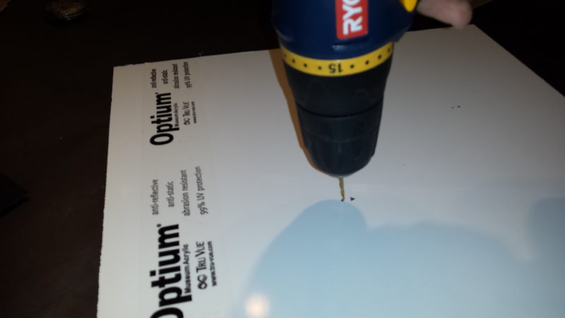
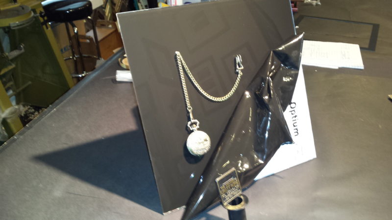
The watch is wired down in three points. I threaded the gold wire through the two small holes at each of the three spots to secure the watch chain in place… Leaving the protective paper on was the key. This saved the surface while I worked on mounting the items. Removing the covering was the last step. I waited until all the other framing components were complete and the frame was ready to fit.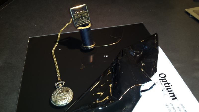
Now for the photo, it is floated on black foam core that has been attached to the acrylic using the same drilling process. Instead of using wire, I used monofilament thread in an X pattern (like sewing on a button) to secure the first piece of black foam in place. The next piece of black foam core is attached to the back of the photo with mulberry hinging paper and wheat starch paste. The final step was to glue the 2 pieces of foam together. By doing it this way, it allowed me to position the photo exactly where I wanted it.
Now for the other nuts and bolts, can I talk about how much I love this frame combination? The stacked frames are from Larson Juhl’s Whitman collection. I love the finish and the flexibility for stacking with the different profiles. I often use narrow frames on top of a wider moulding turned on its side. I do this so often in fact that Larson Juhl knows the routine and happily chops these complicated cuts for me. These difficult stacks allows me to offer countless shadowbox combinations without being confined to the typical manufactured deep frames. Besides, I love doing the unexpected. Inside the frame, I used a black linen mat trimmed with a fillet that would go on top of the mirror. Here came problem number two. How do I hide the back of the fillet so it isn’t reflected?
If you’ve ever noticed the unfinished edge of a frame that is reflected in the mirror, you know the struggle is real. That little detail can spoil an otherwise good design. The answer to disguising the underside of the fillet was to add a solid core black mat. I realized this of course after trying black tape, followed by painting the fillet, both failed the design test. The hidden mat was cut just shy of the edge of the fillet and looked clean and perfect.
The project was ready to fit. The mirror was in place. The black linen mat and fillet, with solid-core black mat hidden underneath, was placed on the mirror. The drilled piece of OMA with watch and photo rested on the mat. That space was enough to reflect the back of the watch. Then I placed a half-inch black linen mat spacers along the sides of the frame. This supports the outer piece of acrylic and keeps the acrylic from touching the watch.
When it came time to assemble all of the components, I took a deep cleansing breath and prepared to tackle fitting this triple reflective threat. I don’t have to tell you that this is a framer’s nightmare! Here’s how it went. I cleaned the mirror; added the mat; remove the cover on the OMA and put in place. Wait! There’s dust. I pulled back the OMA and blew off the dust from the mirror for the umpteenth time; then repeated this process several times. The same went for the final piece of OMA that sat on top of the black spacer. In the end, after the finally dust cover and wire were attached, the results were well worth the effort.
This 12” x 12” shadowbox gives viewers a visual treat for the eye. The color scheme is deliberately simple only showcasing black and brown with a touch of aged metallic bronze. The stacked frames add interest to the design without overwhelming the small scale of the items. The black linen provides a visual anchor and a place for your eye to rest between the items and the frame. But my favorite part by far is the mirror. The reflective surface captures the viewer’s eye and draws you in for a closer look; exactly what good design should do.
Shadowbox displays like this, can show off family treasures with an elegant and modern style… and a bit of a mystery as to how the items appear to be floating in space. Imagine how a frame like this hanging in your store would spark customer’s imagination. I hope you build your own. Use a photo from an antique store and inexpensive pocket watch and show off your shadowboxing skills. When customers ask how the items are in there, just tell them it’s a little bit of framing magic.
* This article appeared in Picture Framing Magazine in July 2018.
DAVIS & DAY | The Boys of Summer
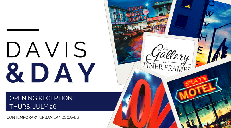
Introducing the paintings of Toby Davis and the photographs of David R Day
The boys of summer are here and they’ve brought brand new work that is fresh, fun and contemporary.
TOBY DAVIS
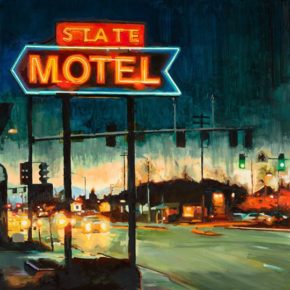
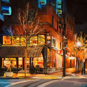
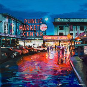
Toby Davis is one of the most popular artists in the Gallery and is definitely one of Idaho’s top artists to watch. Although he’s only been painting professionally a few short years, his unmistakable style has caught the eye of collectors and critics. He was featured as a top artists of the Rocky Mountains in Southwest Art Magazine.
Toby Davis is equal parts urban historian, documenting the structures and forms that shape a community, and modern artist, capturing the pulse of the city and re-creating those reflections, angles, and bursts of color in oil on canvas. “I like working with the perspectives and lines that come with a cityscape—busy scenes that involve traffic, lights, and signs,” Davis says. “I like trying to capture the energy and beauty of an urban environment.” Southwest Art Magazine, June 2016
We currently have 15 new original paintings on display exclusively in the Gallery through late August. Sizes range from 12×12″ up to 30×30″. To inquire about any of these originals EMAIL US or call 208-888-9898
DAVID DAY
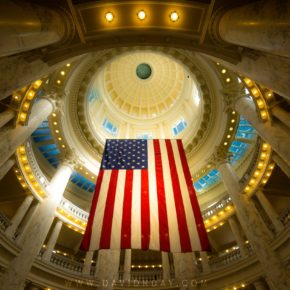
Few photographers capture iconic Idaho the way David Day can. He has a unique talent for seeing the unseen and presenting the viewer with a new perspective. His fresh approach has made him a legend in Boise and we are thrilled to welcome him to the Gallery for the first time.
I was that little kid, the one with the camera always in his hand. Soon it was taking the Chess Club photos for the Borah High yearbook, then head shots for friends and business colleagues. Add in rock band press and CD covers to a couple of college classes and you have a pretty serious photographer. www.davidrday.com
We are featuring David’s photographs on canvas in sizes 16×20″ up to 24×36″ and metal prints beginning at 8×10″ and 16×20″. Contact us for more details. Email gallery@finerframes.com or call 208-888-9898
Photo Workshop
David will be teaching a one-night-only photography workshop Smarter Phone Photos on Tuesday August 14 from 6:00pm to 8:30pm. Designed for iPhone users, this hands-on class teaches you how to get the best shots for portraits and travel photographs. As a bonus, you learn basic photo editing and how to use the best iPhone apps to get smarter pictures with your cell phone. $35 class fee. Register Online Here
Framing for Love
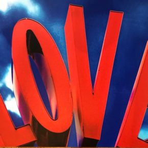
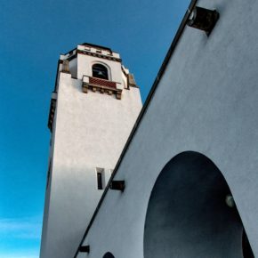
I think I’m in love with these project ideas.
We’re ready to help you surprise your love this Valentine’s Day with a creative frame that they will remember forever.
Please check your feed, the data was entered incorrectly.GEOFFREY KRUEGER | Seeing and Looking
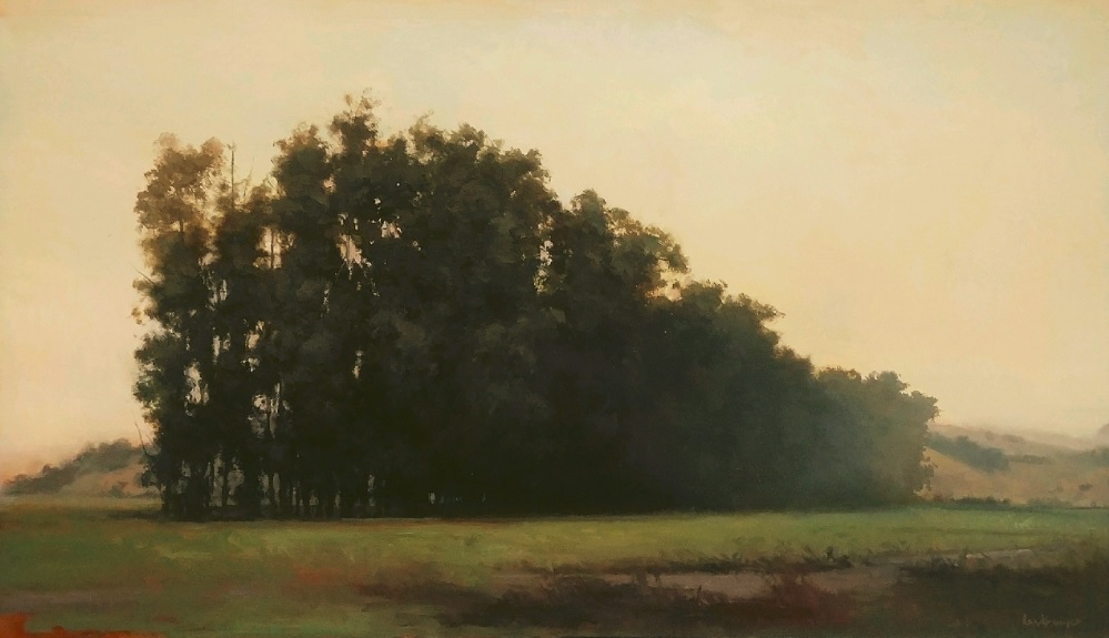 The pastoral nature & subtle beauty of Idaho’s foothills are images few can capture, but this is something Geoffrey Krueger does effortlessly. Originally from Southern California, Geoffrey spent his formative years painting mile-long windbreaks, migrant workers in strawberry fields, and muddy tracks through acres of orange groves.
“There is a particular light in that area that’s influenced by the close proximity of the ocean,” said Geoffrey. “The light is scattered by the marine layer and melts the distance into a bluish haze. I try to get that light down on canvas.”
Now a resident of Boise, Geoffrey finds his inspiration in Idaho’s rolling hills, winding rivers, and our distinctly difference seasons.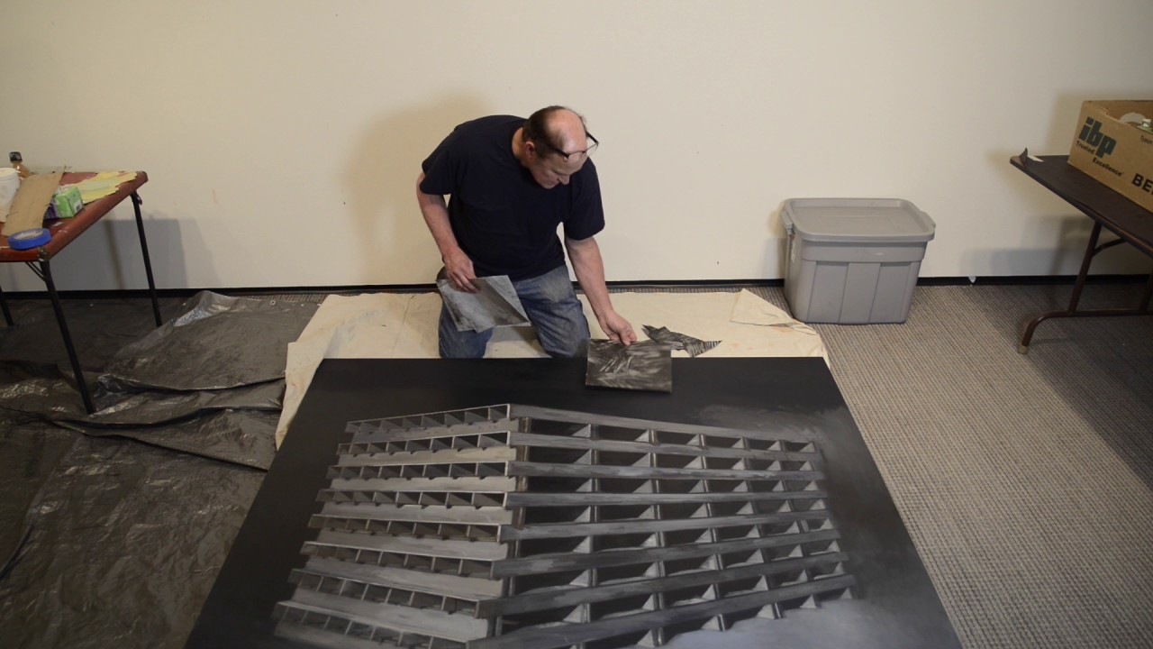
“I make art all day long,” said Geoffrey. “When I go home I think about making art. I imagine work as it might appear on the wall in my home. I draw out ideas and make notes that are hard to read the next day. At first my vision of the finished piece far outstrips the actual painting and so it takes focus, tenacity, work and faith to push to the end. It seems to me that the first 80% of painting goes fairly quickly. It’s the last 20% where things slow way down because I constantly adjust colors and examine my response to what I see. It’s this last part where the real painting begins. I have found that I am very attracted to depicting light and space and strive for that illusion in most of my work.”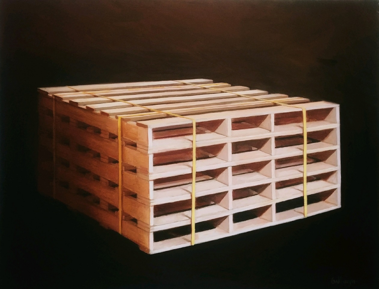
An exhibition of Geoffrey’s original landscape and abstract paintings will be on display in the Gallery January 20 through March 15, 2018.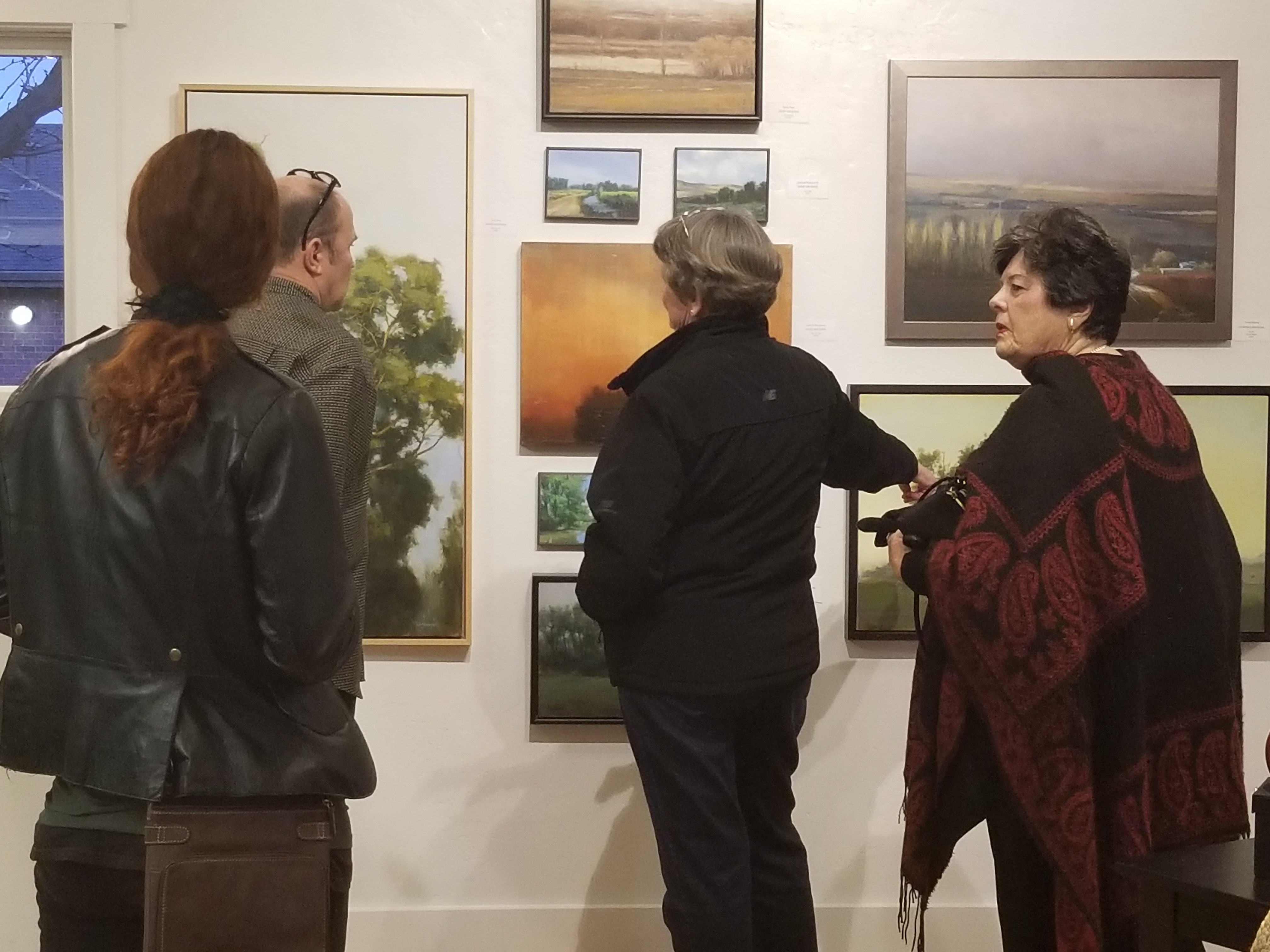
Geoffrey will be in the studio for our Last Thursday Art Party on January 25 and February 22 from 5:00pm to 8:00pm. The exhibit continues through mid-March.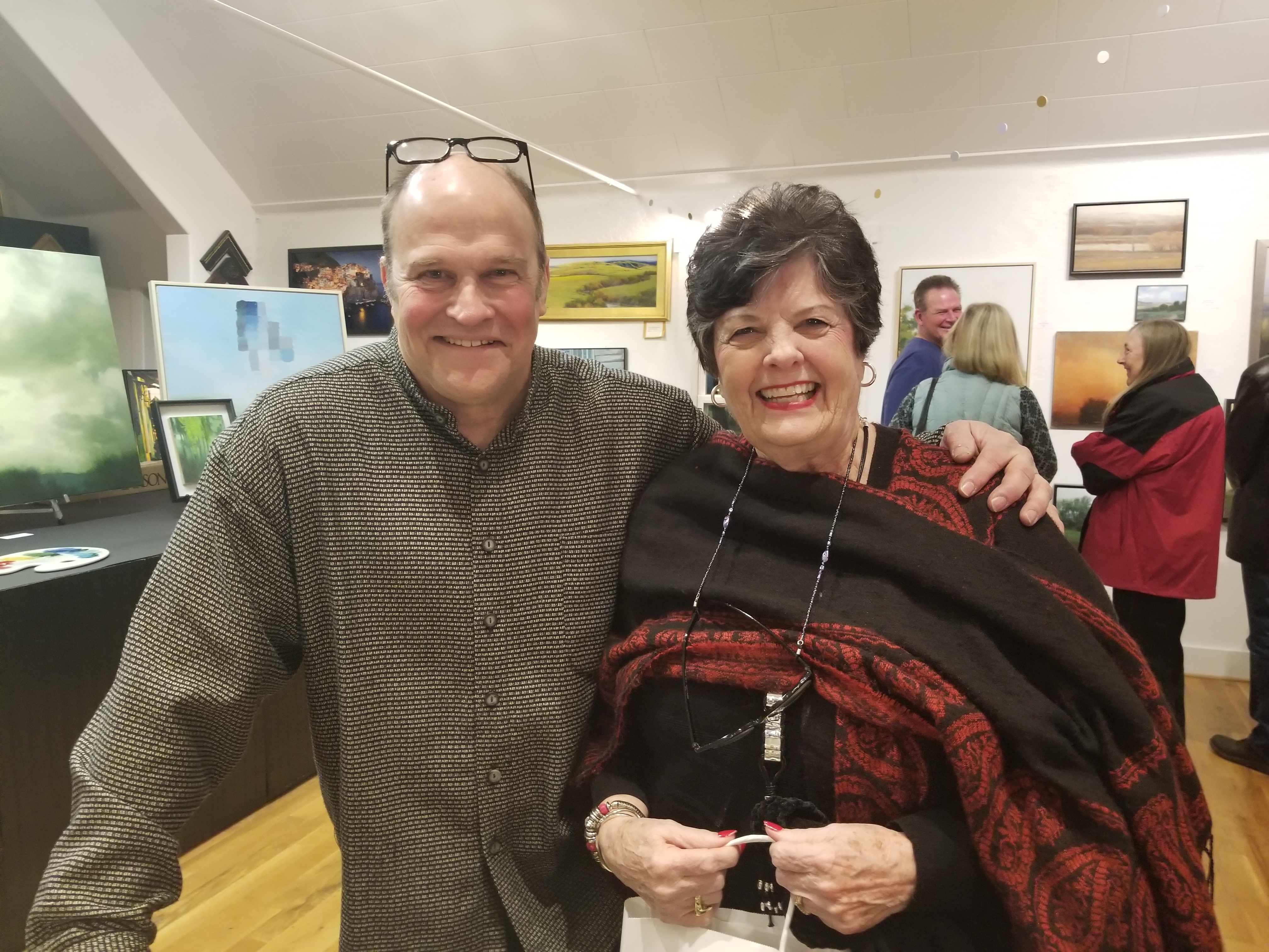
A Guide to Commissioning a Portrait Painting
Commissioning your very own piece of artwork is a great way to celebrate a milestone or memorialize a loved one or a favorite furry friend… and it’s a lot easier than you’d think!

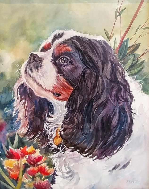
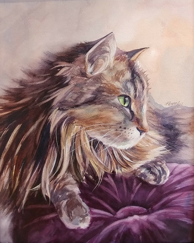
Meet portrait artist Renae Hill, a local watercolor artist that specializes in creating original portrait paintings. She uses her passion for storytelling to create a unique work of art filled with meaning.
What is a commission & why buy one?
A commission represents the best of both worlds – it’s an original work of art that is custom tailored to fit you. Purchasing a commission allows you far more freedom to get exactly what you want in your art selection than searching for hours to find the perfect piece. .
What is the process?
The commission process begins with a conversation – what would you like? When designing the piece, send the artist good quality images for references. The artist will then make a rough sketch, and send it to you for confirmation. Once finished, another photo will be sent for approval before shipping. Renae follows a similar process. Once she receives reference photos and a down payment, she can get started. She’ll create a rough sketch, and send a photo for approval. Then, when she knows you are happy with the piece, she will start in earnest.
How long will it take?
It depends on the artist. Many factors must be taken into account – the size of the piece, its complexity, materials used, mounting & transport, as well as the artist’s schedule. The best way to find out is to talk with the artist directly. Because Renae works in quick-moving watercolor, she can usually have a painting completed in a week or two.
How much does it cost?
Most artists start with a base price, and will increase incrementally depending on a number of factors, including time & materials, as well as how many faces are in the painting. A 50% down payment is requested before the piece is started, so the artist can cover preliminary costs (materials, canvas, etc). Renae’s portrait prices are start at a very reasonable $400 for an 11″ x 14″; $600 for 16″ x 20″; and $800 for 18″ x 24″
Can you do it from a photo or must it be real life?
Both! But again, it depends on the artist’s preference & what precisely is being created. Renae likes to use 3 different reference photos, so she is able to add her own whimsy & artistic flair. She looks for quality photos with good coloring and a well lit subject in the pictures. If you are wondering about the quality of your reference photo, just email it to us so we can take a peek.

What if I don’t like it?
The goal of a commission is to create a piece of art that you love. During the design process, you will likely have many opportunities to say “Yay!” or “Nay!” to what is being created, so that by the end of it you will have a piece that is specifically tailored to you.
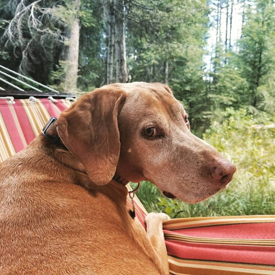
Reference photo of my 10yr old Vizsla Tikka
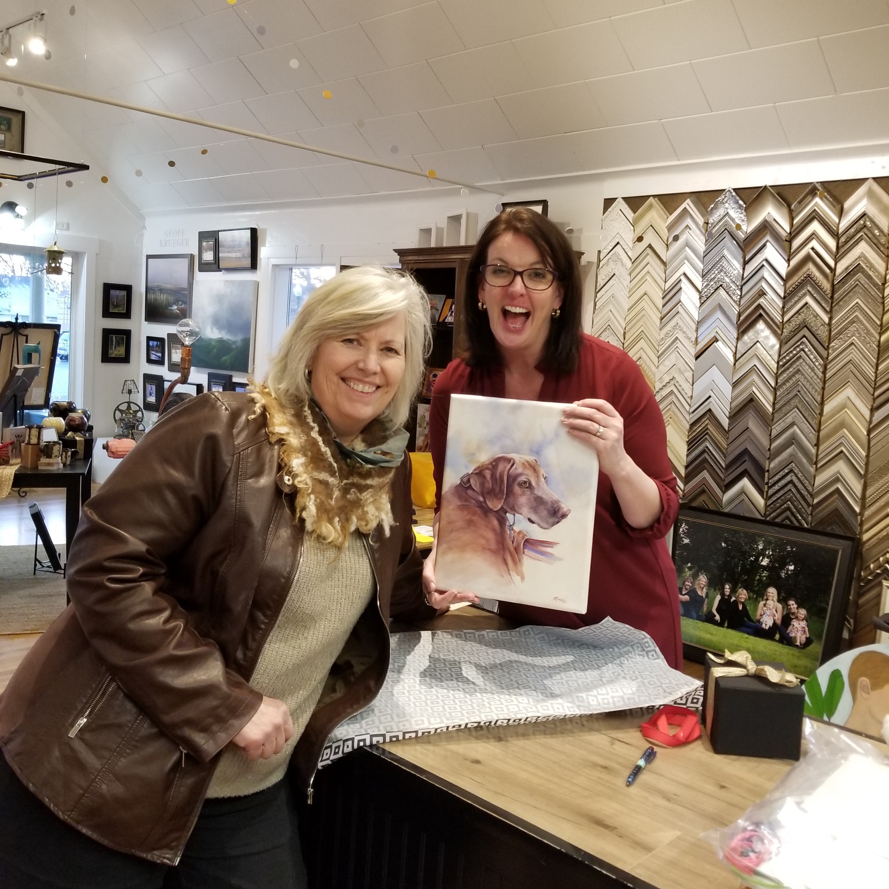
In less than a week, Renae presented me with the finished portrait. Can you tell I liked it?
About Renae Hill
“As an artist I work at creating my paintings that speak both to me and to others about the beauty that exists,” said Renae. “I can look at a scene in nature or an interesting old woman and have to tell my own story about it. My watercolor and oil paintings allow me to show light, shadow and the rich blending of color to make my story come alive.”
Rene has a passion for people, and portraiture. She was taught that if you can draw people, you can draw anything. Rene took this idea and ran with it. Now she gets her inspiration from a number of places, and will often edit her base references in order to create something really spectacular.
“Walking down an old cobblestone street in Austria with the flowers in bloom, I see the scene in my mind and how it will become a painting… As an artists I can take the things that are working and leave out the things that don’t work. I’ve always believed that when you become an artist you see things in an extra dimension. You learn how to really see the world around you as you study shape, color and light.”
If you’d like to know more about how to order a special commissioned portrait of your beloved person or pet, please contact us for an initial consultation. Renae would love to meet you at The Gallery and show you examples of her inspiring work.

You can find more examples of Rene’s work at her website