
ART WITH HEART Benefit Art Show
Shop with a Purpose this Thursday
Shop for art and help area seniors during the opening night of the Art with Heart art show.
OPENING RECEPTION
Thursday November 29, 2018
5:00pm to 8:00pm
Click Here for Map to FINER FRAMES
Finer Frames loves our seniors and want to help support their independence and those who help them. Our staff has all been personally touched by the struggle aging parents go through to remain independent at home. We see the generous work of volunteers that care so much and we wanted to help too! Boise Metro Meals on Wheels serves 1,000 meals to home bound seniors each weekday. They do this with an incredible group of dedicated volunteers and through donations like yours. With each purchase you make of beautiful hand-painted artwork, you help this great cause.
There are well over 100 original paintings created by 50+ artists from across the West. All are small and perfect for gift giving. These are just a few examples of works of contemporary art, watercolor, pastel and traditional oil paintings.
-
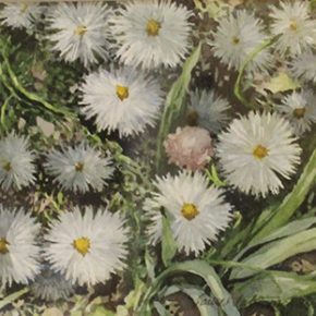
- Laurel Lake McGuire
-
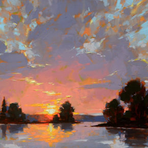
- David Mensing
-
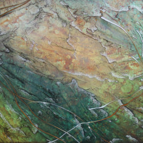
- Lauren Kistner
The show continues through January 2019.
CALL FOR ARTISTS | Art with Heart
Now accepting submissions for our 2018 holiday art show
The Nitty Gritty:
- Art must be under 30 united inches (length+height) including the frame
- Send up to 3 images to gallery@finerframes.com with Art with Heart Submission in the subject line
- Include outside dimensions, title and cost in the description
- Only original work of a suitable subject matter will be considered
- Artists will receive 40% of the retail sales price. 20% will be donated to Meals on Wheels
- Deadline for submissions is 5:00pm FRI NOV 2
A Totally Eclipsing Project
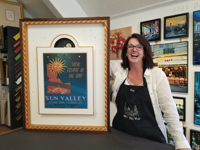 My obsession with innovation for frame design is notorious with my staff. I’m often met with a look of disbelief when I tell them what I want to build. They learned long ago that just because I’ve never done it before, does not mean I won’t attempt it. It’s a philosophy that may be best explained like this. If you want to fly, jump off the cliff and learn to build the airplane on the way down, because after all, innovation is born out of necessity. So, when it came to this project, I wanted to apply the same principal and create something I’ve never built before.
The project I’m describing was the perfect combination of the customer’s trust in me and my desire to dazzle them in an unexpecting way. My purpose in every project is to deliver more than the customer expects and now after nearly 20 years in business, that’s getting a bit more challenging to come up with never been done before ideas. When this project landed on my design counter, I knew I had to design a frame that would shine like the stars.
“It’s just a poster.” I’ve heard this countless times. Sometimes, the ten dollar poster is a souvenir from a special moment that the family wants to remember forever and an inexpensive poster frame just won’t do. That was the case of this eclipse poster. It had tremendous sentimental value to my long time customers. Because I knew them well, and have seen their home, I knew they love color and creativity. That insight was enough to get me started on what would become one of my favorite projects.
The subject of the project was poster commemorating the 2017 eclipse that crossed through Sun Valley Idaho. The poster was designed by a local artist and had beautiful colors of orange, blue and brown. The customer brought me the poster, a postcard and eclipse glasses with the instructions to “be creative”. We looked at a few frames then he left me to fly on my own.
DESIGN: First off, the postcard didn’t go with the poster. The colors were all wrong. And the glasses didn’t fit with my concept, so they were out. Something my customer said about his fascination with the movement across the sky sparked the idea of incorporating a similar movement inside the frame. That led me to the idea of a clock mechanism to power the rising moon just like inside a grandfather clock. This became the concept for design that I built the frame around. I should mention I was nervous about leaving out the glasses, so I had a backup plan to add them incase my customer insisted on using them inside the frame. He didn’t, so I left them in a nice pocket on the back of the frame.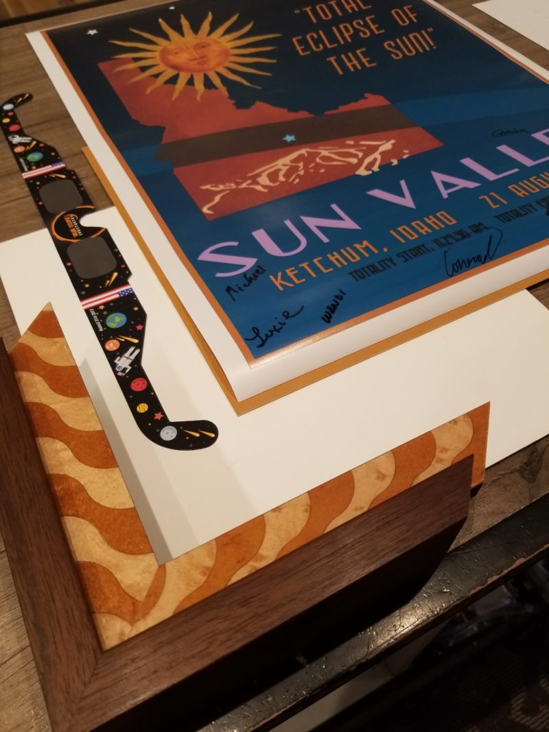
COLOR: Most of my designs incorporate just two colors plus one neutral. In this project, white was my neutral and orange and walnut brown were my main colors. I do this on purpose. When I want to emphasize the blue in this case, I don’t use it anywhere in the design. By choosing the harmonious colors of orange and brown I haven’t created visual competition within the frame and there is nothing to compete with the blue. This leaves the viewer’s eye to discover the contrasting colors on their own.
SHAPE: Inspired by images of the grandfather clock, I designed the mat around the poster like a clock face. The narrow white mat surrounds the poster and its arch at the top hides the revolving sun and moon. It’s trimmed in a ¼” orange mat to coordinate with the frame. The poster and mats are elevated 1” above the background mat to give plenty of room for the motor.
MOVEMENT: The show stopping part of this shadowbox is the sun and moon that rises and sets behind the floating mat. The motion is an eye-catching detail that really adds the “wow” factor to this project. The artwork was created on an 8” circle of heavy card stock with the sun and moon on opposite sides. I attached the circle to the second hand of an inexpensive clock motor I found on Amazon. The truth is, this took several tries to get the right size and weight of the paper. Our first try was far too heavy to be powered by the delicate motor. Persistence paid off and on the 4th try we found the right size, weight and balance for it to run smoothly. Under the mat, the foamcore surrounds the motor and holds it in place. Access to the batteries is easy to reach when the frame is off the wall.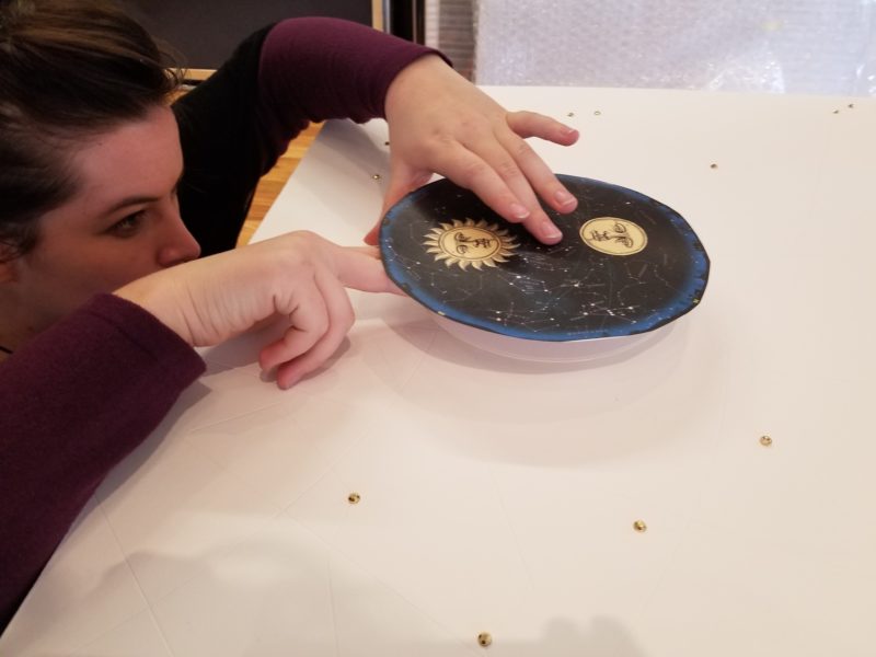
PATTERN: One of my favorite elements of this project is the constellations carved in to the back matboard. We used our Wizard to trace patterns of the constellations and then cut them as V-grooves all around the mat. Major stars are highlighted with gold bedazzel stickers and the smaller stars have white dots of puff paint.
CONTRAST: I love using different finishes against each other. In the case of this frame, the high gloss lacquered finish of Global Art’s Contempo Expressions contrasts with the matte natural walnut finish of Larson Juhl’s Cranbrook frame. Playing the different finishes against each other adds interest to the frame design. Light against dark and shiny against matte is repeated throughout the design and is a trick I often use.
THE RESULTS: To say that my customer was surprised isn’t enough to describe his reaction. It was the kind of reaction that makes me do what I do. His heartfelt appreciation for our efforts made all the effort more than worth it. It was such a hit, the frame traveled to the West Coast Art & Frame Show in January 2018 as part of Tru Vue’s booth display. You can see his reaction and learn more about the project on my YouTube channel https://youtu.be/s_id82aC1ks
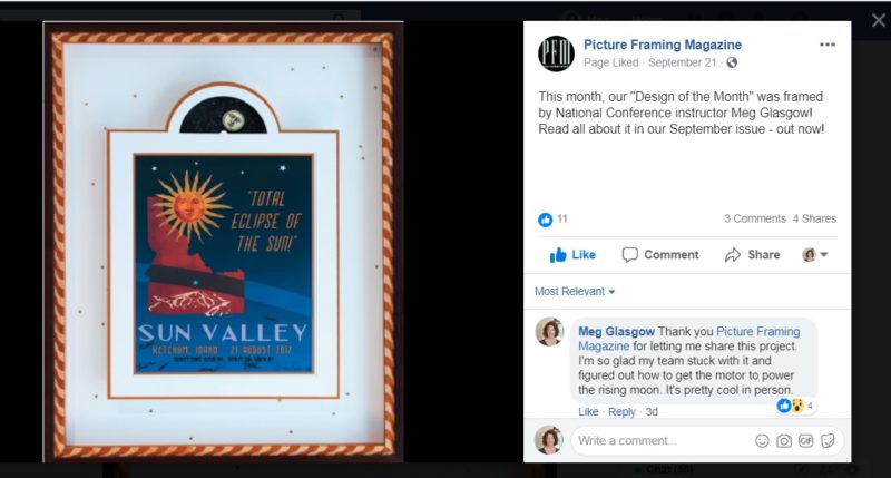
Picture Framing Magazine Featured Post
Eagle Art Walk | September 27, 2018
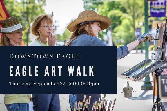
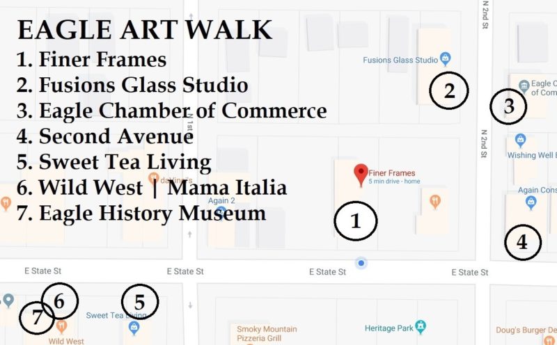
The Eagle Art Walk brings art lovers and community members to Downtown Eagle on the last Thursday of September. With exciting and unique offerings around every corner, Downtown celebrates the arts with local artists set up in galleries, shops, and cultural institutions located along East State Street, between Eagle Road and 2nd Avenue.
Map to Artist Locations
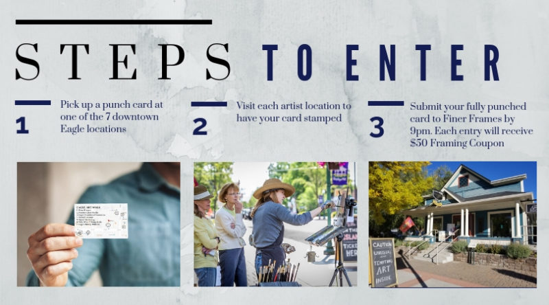
For the true art collectors and fans, arriving early offers a more relaxing stroll to enjoy live music & wine tasting. Pick up your punch card at Finer Frames, visit each artists and be entered to win neat prizes. The event runs from 5:00pm to 9:00pm.
As the evening progresses, more visitors descend on the area to meet up with friends and savor the local experience.
Gazebo Concert Series
Held in downtown Eagle at Heritage Park, the Gazebo Concert Series is offering the final free concert of the season. The City of Eagle, Eagle Parks & Recreation and 1st Interstate Bank invite you to join us. This all ages and family friendly event is FREE and open to the public. Grab dinner from one of the many food and drink vendors that will be on site and make it a night. Come down and listen to some great music and kick back and relax! The free concert runs 6:30pm to 9:00pm.
September 27th: The Sawtooth Serenaders and Tylor & the Train Robbers
Post Modernism, Quantum Mechanics and the Anatomy of a Painting
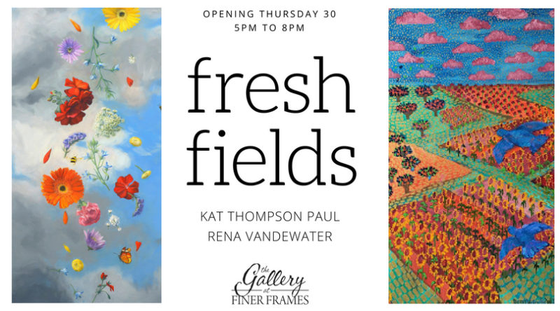
Our latest color-filled art show opens Thursday, August 30, 2018. It features the lively work of two stellar women artists. Rena Vanderwater is a legendary post-modern artist that is well known to Southwest art collectors. Kat Thompson Paul spent years as the Art Director at Nordstroms in Seattle and now brings her vividly detailed paintings to the Gallery in a show that continues through September.
OPENING RECEPTION
Thursday, August 30, 2018
164 E State Street, Eagle Idaho
5:00pm – 8:00pm
RENA VANDEWATER
-
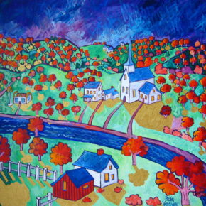
- America by Rena Vandewater
-
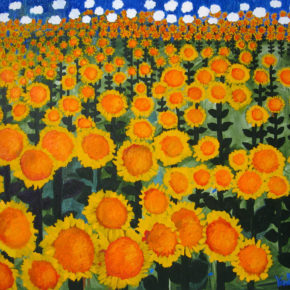
- Sunflowers 48×36
-
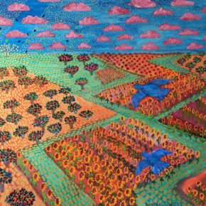
- RENA VANDEWATER
My passion is color. The result is many oil/acrylic paintings I’ve created over the last 45 years. Most have been sold through galleries in Arizona,California and Idaho or through my web page – RenaVandewater.com. I’m included in many public and private collections across the United States and a few in Europe. I get my ideas from life: traveling, living on a farm and mainly from a vivid imagination. After my children were grown, I went back to school and earned a Masters of Fine Art degree. The educational process put me in touch with postmodernism and more importantly, the science of Quantum Mechanics. Quantum theory suggest a mysterious and positive way of looking at the world. In my most recent work, I use the oil/acrylic color medium to create a fresh and colorful painting to help to visualize this new world view. I like to think of Grant Wood and his happy contribution to the world during the depression years. It is my current belief that there is so much war, fear and uncertainty in our lives, I have no desire to add to it with bleak or didactic paintings. My work is harmonious and uplifting while having a strong presence of atmosphere and intensity.
K THOMPSON PAUL
-
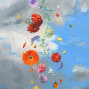
- KAT THOMPSON PAUL
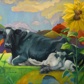
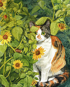
I long to paint beauty and happiness; I find it in things rural and simple. The more I search, the more I find: vibrant colors, smiling eyes, thick swishy paint, animals that make me laugh—like perambulating bugs and hairy horse noses. Light is a miracle. Stars a wonder. Without art, I would not see these things. I am painting to find my new normal. I am experimenting with less detail to see if I can paint dangerously and more joyfully.
Here’s a how Kat describes her process for constructing a painting.

Keep up with what’s happening in the Gallery on Instagram