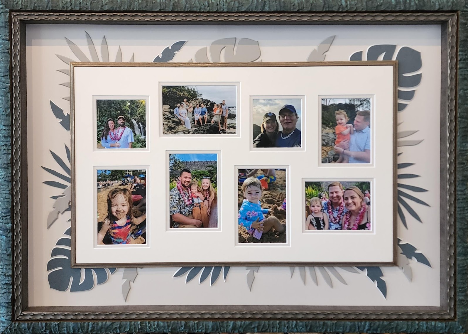
Marcus Aurelius had it right, what stands in the way becomes the way. I never thought our family vacation would evoke the sentiment of an ancient stoic but that’s what happened when the ten of us set out for Maui. Delayed flights led to cancelled flights and that led to all of us stranded around a mountain of luggage wondering how we were going to get to Hawaii. It was through that struggle that our blended family pulled together, solved big problems and ended up having the time of our lives. The memories we made on that not so perfect start to an amazing trip will last forever and so will this very special frame.
I had so many fantastic pictures, it was hard to narrow it down to eight for this photo collage. Not surprisingly, most were of my two grandbabies smiling and laughing. Adorable! But I thought I had better include their parents in the mix, so they didn’t think I was playing favorites.
The colors in the Maui pictures were so vibrant and beautiful I had thought the frame would play up the bright tropical tones. Early versions of the design centered around using bold lacquer frames and brightly colored mats. I tried to find a combination that appealed to me, but never could pull the right combination together until I stumbled on these muted mat colors. I knew I had found the ones. It makes more sense to me to stick with neutral tones and let the bright colors in the photos to speak for themselves. It’s more my style anyway. Once again, the ancient philosopher had it right, what stands in the way becomes the way.
I eventually chose a combination of four Artique mats. The lightest and I used it as the top mat around the eight photos to bring the pictures forward in the design and give them importance over other design elements. The medium shade is the bottom mat under the pictures as well as the primary background color that supports the entire design. By repeating the color, it united the design through the repetition of the same material. The two accent colors of Artique A4985 Mint Tea and A4844 Moss tie the frame color to the design and add the harmony I was looking for.
For the mat design, I had been thinking about using tropical leaf shapes cut in the matting without knowing exactly how I was going to create them. The idea came from a quick Google image search for Hawaiian themed graphic borders. A quick side note here: if you’ve ever stuck trying to figure out a mat design for your CMC, try searching vector art. It’s a solid place to find inspiration. In this case, I stumbled across an idea with tropical leaves under a bamboo border that surrounded a party invitation. I knew that could work.
For a second, I thought I could use real bamboo, you know the kind you get at the garden store for plant stakes. It didn’t take long to ditch that idea. It was going to be too hard to fit them in the frame. They would take up too much room, so I opted for a fillet instead. Lucky for me, I had enough of Larson Juhl’s discontinued fillet on hand in the shop. It was a good match and I loved repeating the same color in the frame. What was different about it was how I used it in the frame. I cut it backwards from what’s typical for a fillet. It became a little mini-frame to surround the inner mats.
Now for the leaves. The Frameshop software in my Wizard computerized mat cutter included one type of palm leaf as clip art. That was a good place to start, but I wanted to use three different shapes in the design. I needed two more. Since they didn’t exist, we created our own in the Trace program. It was simple to upload an Vector image of a monstera leaf we found on Google Images and trace over it to create our own custom cut art template. It took some tweaking to get the bevels set to cut correctly for the cutouts in the leaf. We experimented with sizing the leaves to find how small we could successfully get a perfect cut, which was about six inches. We repeated the same process to create the palm frond design. The three leaf styles cut out of two different mat colors became all the tropical leaves. Arranging them was easy. I was careful to mix up the colors and leaf patterns to keep the design in balance.
The entire project finally came together when I combined the two frames from Bella Moulding. I chose the Gaudi Smoked Bronze for the inner frame because it reminded me of ocean waves and the Quarry Turquoise Dome Cap because it was just perfect. Can I stop for a second and just say how much I love the Quarry collection? I love the texture. I love the colors. I love everything about this collection except the price, but hey, it’s for my family and they’re worth it.
To finish the project, I used Tru-Vue’s Museum Glass. The frame measures 22×33 inches and took close to three hours to complete. The retail cost of the project would be approximately $1400.
The twists and turns taken in creating this project were like our vacation. It didn’t quite go as expected, but the outcome was better than we had hoped. The adversity we overcame brought us all together and made the experience sweeter than we ever expected. As it turns out Marcus Aurelius was right. The obstacles were what we needed to make memories that brought us closer and this frame will remind us of the joy and love we felt.
This article was published in the August 2022 issue of Picture Framing Magazine.
Leave A Comment
You must be logged in to post a comment.