 My obsession with innovation for frame design is notorious with my staff. I’m often met with a look of disbelief when I tell them what I want to build. They learned long ago that just because I’ve never done it before, does not mean I won’t attempt it. It’s a philosophy that may be best explained like this. If you want to fly, jump off the cliff and learn to build the airplane on the way down, because after all, innovation is born out of necessity. So, when it came to this project, I wanted to apply the same principal and create something I’ve never built before.
The project I’m describing was the perfect combination of the customer’s trust in me and my desire to dazzle them in an unexpecting way. My purpose in every project is to deliver more than the customer expects and now after nearly 20 years in business, that’s getting a bit more challenging to come up with never been done before ideas. When this project landed on my design counter, I knew I had to design a frame that would shine like the stars.
“It’s just a poster.” I’ve heard this countless times. Sometimes, the ten dollar poster is a souvenir from a special moment that the family wants to remember forever and an inexpensive poster frame just won’t do. That was the case of this eclipse poster. It had tremendous sentimental value to my long time customers. Because I knew them well, and have seen their home, I knew they love color and creativity. That insight was enough to get me started on what would become one of my favorite projects.
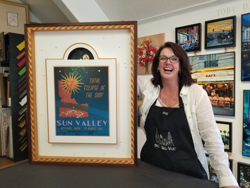
The subject of the project was poster commemorating the 2017 eclipse that crossed through Sun Valley Idaho. The poster was designed by a local artist and had beautiful colors of orange, blue and brown. The customer brought me the poster, a postcard and eclipse glasses with the instructions to “be creative”. We looked at a few frames then he left me to fly on my own.
DESIGN: First off, the postcard didn’t go with the poster. The colors were all wrong. And the glasses didn’t fit with my concept, so they were out. Something my customer said about his fascination with the movement across the sky sparked the idea of incorporating a similar movement inside the frame. That led me to the idea of a clock mechanism to power the rising moon just like inside a grandfather clock. This became the concept for design that I built the frame around. I should mention I was nervous about leaving out the glasses, so I had a backup plan to add them incase my customer insisted on using them inside the frame. He didn’t, so I left them in a nice pocket on the back of the frame.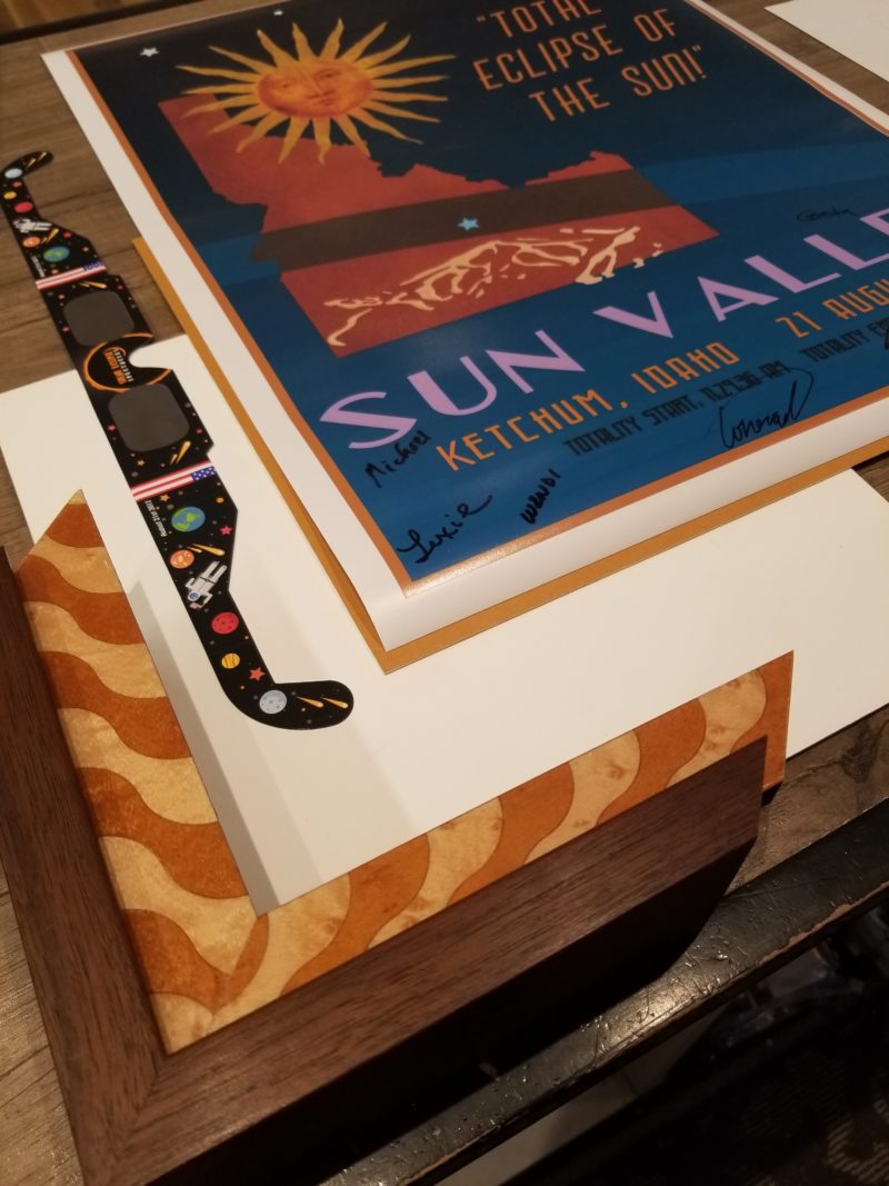
COLOR: Most of my designs incorporate just two colors plus one neutral. In this project, white was my neutral and orange and walnut brown were my main colors. I do this on purpose. When I want to emphasize the blue in this case, I don’t use it anywhere in the design. By choosing the harmonious colors of orange and brown I haven’t created visual competition within the frame and there is nothing to compete with the blue. This leaves the viewer’s eye to discover the contrasting colors on their own.
SHAPE: Inspired by images of the grandfather clock, I designed the mat around the poster like a clock face. The narrow white mat surrounds the poster and its arch at the top hides the revolving sun and moon. It’s trimmed in a ¼” orange mat to coordinate with the frame. The poster and mats are elevated 1” above the background mat to give plenty of room for the motor.
MOVEMENT: The show stopping part of this shadowbox is the sun and moon that rises and sets behind the floating mat. The motion is an eye-catching detail that really adds the “wow” factor to this project. The artwork was created on an 8” circle of heavy card stock with the sun and moon on opposite sides. I attached the circle to the second hand of an inexpensive clock motor I found on Amazon. The truth is, this took several tries to get the right size and weight of the paper. Our first try was far too heavy to be powered by the delicate motor. Persistence paid off and on the 4th try we found the right size, weight and balance for it to run smoothly. Under the mat, the foamcore surrounds the motor and holds it in place. Access to the batteries is easy to reach when the frame is off the wall.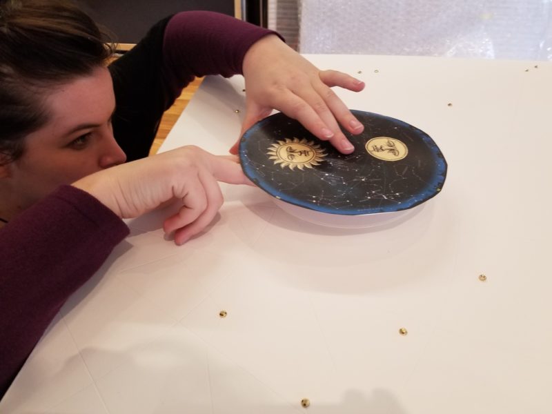
PATTERN: One of my favorite elements of this project is the constellations carved in to the back matboard. We used our Wizard to trace patterns of the constellations and then cut them as V-grooves all around the mat. Major stars are highlighted with gold bedazzel stickers and the smaller stars have white dots of puff paint.
CONTRAST: I love using different finishes against each other. In the case of this frame, the high gloss lacquered finish of Global Art’s Contempo Expressions contrasts with the matte natural walnut finish of Larson Juhl’s Cranbrook frame. Playing the different finishes against each other adds interest to the frame design. Light against dark and shiny against matte is repeated throughout the design and is a trick I often use.
THE RESULTS: To say that my customer was surprised isn’t enough to describe his reaction. It was the kind of reaction that makes me do what I do. His heartfelt appreciation for our efforts made all the effort more than worth it. It was such a hit, the frame traveled to the West Coast Art & Frame Show in January 2018 as part of Tru Vue’s booth display. You can see his reaction and learn more about the project on my YouTube channel https://youtu.be/s_id82aC1ks
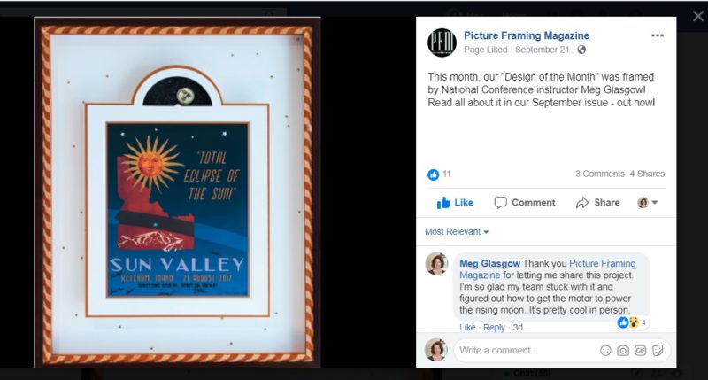
Picture Framing Magazine Featured Post
Leave A Comment
You must be logged in to post a comment.